This happened in Berlin, during a Calligraphy Seminar with Kazuaki “Kaz” Tanahashi.
Among the main characteristics of these seminars two conspired in producing my “accidentally good” work.
The first is that Kaz usually prepares a set of characters to study, providing for each ancient masters examples in the three main styles (standard, semi cursive and cursive).
Among the characters of this specific seminar we had:
玄
(ゲン: Gen)
mysterious; occultness
Radical: 玄 (profound). Strokes: 5画. Elements: 亠幺.
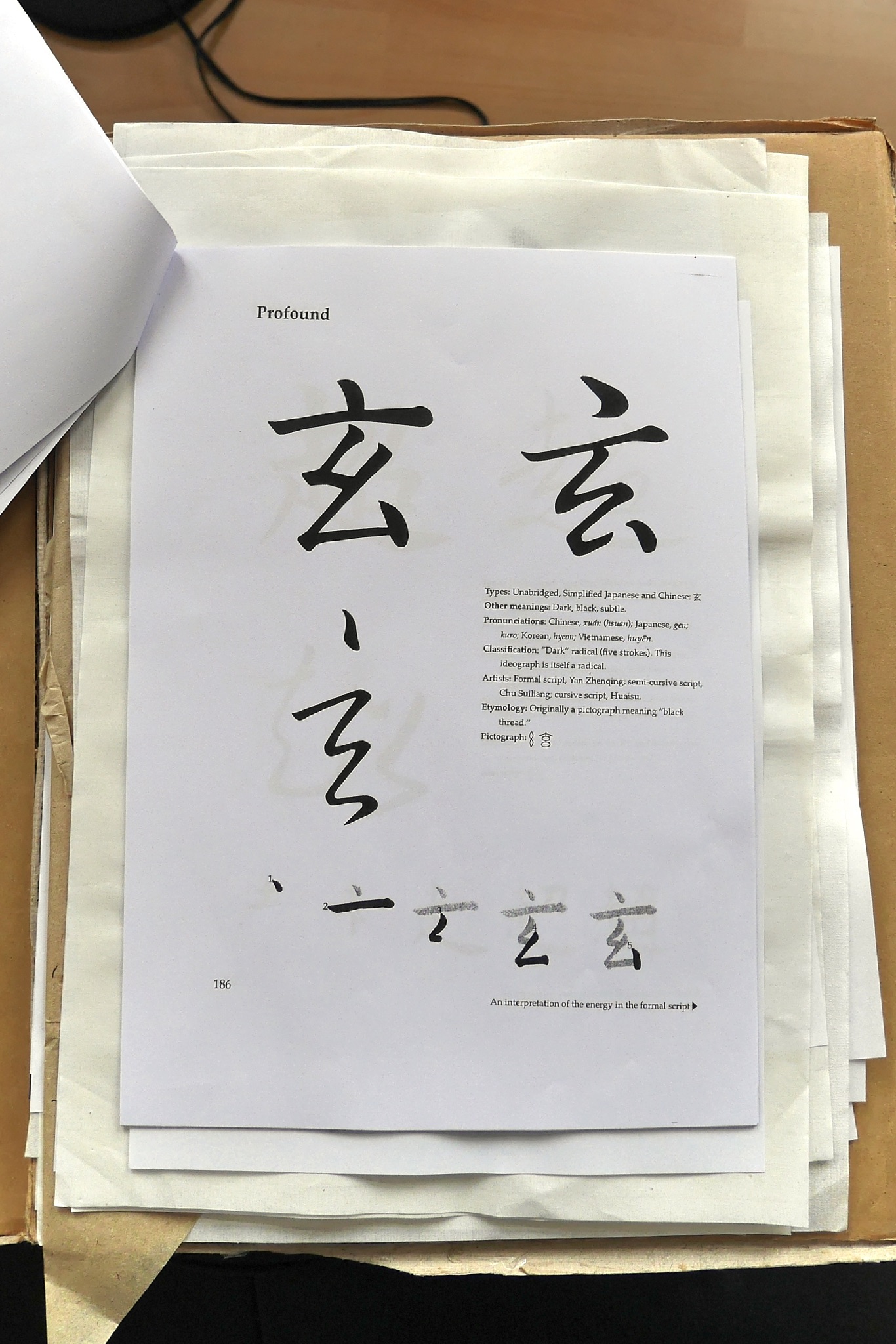
Examples provided for “玄”
Some notes on the meaning, thanks to Eve Kushner:
This kanji conveys the ideas of “mysterious; occult; hidden; blackness; profound”. It is used as part of the name of “brown (untreated) rice” and from then in genmaicha. As a radical it also represents blackness.
It can also imply “subtleness” (again, something hard to see) and together with the Kanji for “Person” (玄人) it comes to mean “professional” (including people who work in illicit trades).
(See also Richard Sears).
The other element is that when possible Kaz always devotes a full day of practice to using colours in calligraphy. And not just replacing the more traditional black ink with some other pigment. He specifically encourages anyone to dip the brush in at least two distinct colours so that they blend as the brush moves on paper, and see what the result is.
A previous experience made me a bit wary of the results: last time I tried this I made a mess and quickly ended up with a container of purple, the result of all the colours getting mixed up at once.
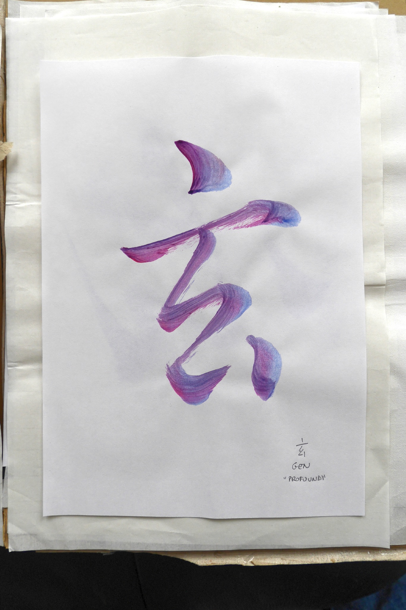
“玄” in semi-cursive, close study
This time I was much more cautious: on the side you can see how this is actually supposed to work - the colours blend on the paper (and of course, on the brush itself) but you can still have some quantity of the original unmixed paints available if you want to do try different combinations.
Here I was doing “close study” of the second (semi-cursive) version of the character.
Btw, Kaz explained that he doesn’t like to use the word “copy” when he ask students to try to reproduce someone else’s calligraphy.
He says: “Copying makes it sounds like a crime, even… like in you copied a DVD… I prefer to call this Close Study”.
I really liked the “Gen” character, aesthetically but also for its meaning, and I especially liked the semi-cursive version… so I soon started trying to get write more freely, and in a more personal way (this would be the “Interpretation” stage, in Kaz’ terminology).
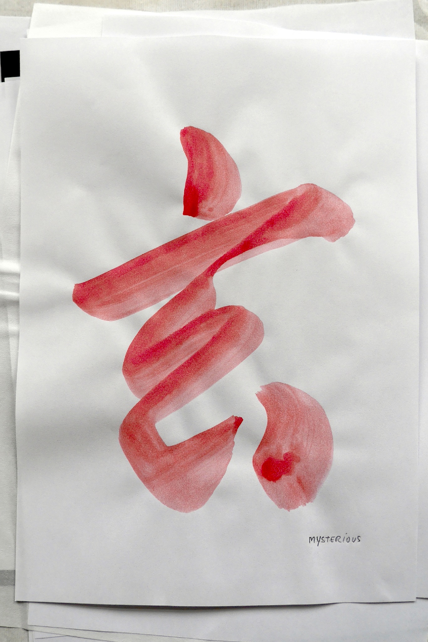
It was looking good, to me, but being still a bit unconvinced about the color-mixing thing I decided to try to get a uniform shade and make a calligraphy that I could proudly put on a wall somewhere.
The basic colours we had (except, of course, black) looked too bright to me, especially considering the root meaning of this Kanji. So I tried to get something that could be sufficiently striking and “serious” to clearly impart the meaning of “mystery”.
Below you can see my best result trying to get some deep red (without ending up - this time - with some kind of nauseous purple).
It’s still too bright, but all the previous attempts (adding blue, adding black) ended in shades I really did not like, and there was plenty of trial and error before getting this.
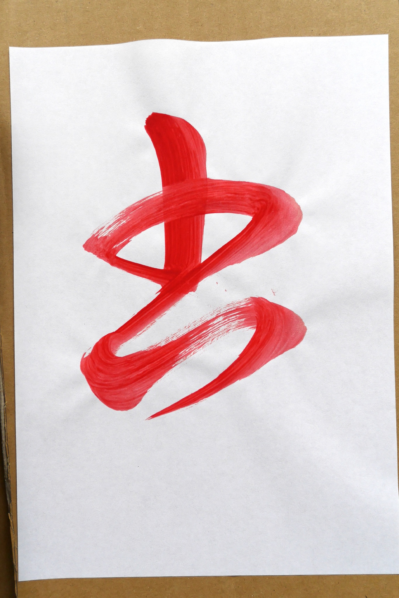
(the character, by the way, is the cursive version of 書 - Sho; i.e. “to write”).
But this, alas, came much later in the day… after the aforementioned long series of trials and errors.
There were plenty of calligraphic errors, for sure… I probably ended up with the largest discard pile of the whole room, but in this case the main problem was really the colour.
Something like this would have been fine…
Specifically, one of the very first attempts to get a solid crimson ended up with a small quantity of some dubious mix halfway between bubble-gum pink and unripe watermelon pulp…
Undeterred, I tried it anyway, maybe hoping that it would look better on paper. Actually I knew already that this would be impossible. I was using white laser printer paper, which is much brighter than proper washi paper, and so anything (except the thickest, densest colour) would look slightly transparent, and definitely brighter.
“Yes, yes indeed… but maybe a little too pink?”
The first dot on top was enough to convince me that the colour was definitely off… but the main point of a calligraphy seminar is to write, and unless there is really some terrible mistake (like a drop of ink in the middle of the work) it is always better to complete the whole calligraphy even if you have already decided you want to throw it away immediately after.
Imagine my surprise in finding out that the end result was pretty nice… in terms of calligraphy.
Powerful, decisive lines. The whole shape well balanced, centered - none of my usual problems manifested.
And - something it made me even more proud - this is definitely my version of the character: just compare it with the examples, or with the two-colours version I did before. This is unequivocally 玄, it is perfectly readable, and yet noticeably different from the original.
So, to sum it up, this was definitely my best work in all three days of the seminar. And for sure my best result in months. And it is still pretty odd-looking due to - of all things - colour. Which normally should not even be an issue when doing ShoDo.
Of course I tried desperately to get the same quality with black ink, and later with other less frivolous tints. Some were passable, but in terms of actual writing, this remains the best.
I was so amazed at the result that I got up and went to Kaz to show it to him and ask if it was “recognisable” as 玄. His answer is quoted below the image above, and will remain as an epigraph for the whole episode.